Better yet, a powerful series of commonly used Conditional Formatting rules are predefined, so visualizing information using color really is a matter of just a few clicks. The Conditional Formatting button also is prominently present on the Home tab of the Ribbon, an indication that the Excel team understands its power for users.
 I particularly like the Data Bars and Color Scales options:
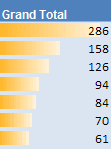
- Data Bars display a color bar across cells to display the relative magnitude of values in a cell range. It makes is very easy to get a visual representation of your data:
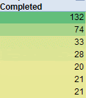
- Color Scales let you color cells using a color gradient. So you really can show subtle differences between numbers in different colors:


 But I'm not so sure this option is as valuable as it looks like at first sight.
Suppose you have the following data about Sales in the first 5 months of the year:
 I'd like to use the 4 arrows option to quickly show whether data is going up or down, month by month. However, when I apply that arrow formatting on the range, this is the result:
 Not quite what I expected. The yellow arrows seems to indicate that February and March are better than January, but in fact, the trend is going down. Looking at the details of this predefined setup, I understand how Excel is using the arrows:
  They are used to represent a relative value in the whole range of the cells, not compared to the previous or next cell. I think this is confusing. There should be an easy way to use arrows indicating whether a value goes up, or down throughout a range, but I haven't been able to figure out how to do that. If you do, please let me know.
Having said that, the Conditional Formatting improvements in Excel 2007 are huge! What I covered here is in fact only the tip of the iceberg.